Graphic Designers Rely on Hierarchy for Impactful Results
Graphic design is a crucial component of modern communication. It allows us to convey messages quickly and efficiently, both visually and verbally. As a result, it has become an essential tool for businesses across the world that rely on it to help them connect with their customers. To achieve successful results with graphic design, as any designer will tell you, hierarchy is essential.
Graphic Designers
Graphic designers rely on a hierarchy to create impactful results that leave a lasting impression on the audience. Every decision made by a graphic designer, from the size and shape of the type to the placement and color of elements, is based upon an organized structure or hierarchy.
By tying each element together in a carefully structured pattern—from large shapes such as headlines down to small details like captions—graphic designers can make sure their work stands out from the rest. A well-planned hierarchy helps create visual order and clarity, which can help viewers quickly identify key points or ideas within a design. Additionally, good use of hierarchy allows for more efficient communication with the viewer while maintaining aesthetic appeal.
What is Hierarchy?
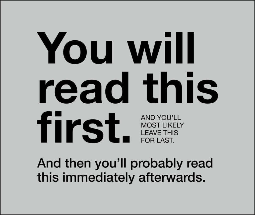
Hierarchy is an organizational tool used in many aspects of life, including graphic design. Hierarchy helps organize information by arranging it according to its most important elements. In graphic design, hierarchy organizes the visual elements on a page in order to create an impactful message and draw attention to specific pieces of information.
Hierarchy works by creating relationships between text and images so that the viewer’s eye is naturally drawn from element to element in a certain order. This not only increases understanding of what is being communicated but also makes the page visually appealing. By determining which visual elements should be placed first, designers can control how viewers perceive their work and ensure their message is effectively conveyed.
For graphic design, hierarchy plays a major role in successful designs that evoke emotion and captivate audiences with memorable visuals.
Why Graphic Designers Rely on Hierarchy
Good graphic design is essential for creating an impactful end product. One of the most important tools a designer uses to achieve this goal is the hierarchy, which allows them to control the flow and order of information in a visually pleasing way. By utilizing this tool, designers can differentiate between prominent and secondary elements, make sure that messages are communicated clearly, and ensure that content is organized in a logical manner.
Hierarchy plays an integral role in developing relationships between various components within a design. It also helps establish clear visual cues as to where viewers should focus their attention first. For example, designers use fonts, colors, sizes, and placement to communicate the importance of certain elements over others. Furthermore, hierarchy provides the structure that assists with navigation through the design so that users can focus on what’s most important without getting overwhelmed or distracted by less significant details.
Different Types of Hierarchy
Hierarchy is an organizational system that is used to bring order and structure to a business or creative project. It relies on the relationship between elements, from graphics, images, and text, to ensure a successful outcome. In graphic design, hierarchy can be used in various ways to create an impactful result.
There are several types of hierarchy that designers can use when creating designs for their clients. A weight-based hierarchy assigns importance to each element based on its visual presence and size relative to other elements on the page. A contrast-based hierarchy uses color and white space to draw attention or set one element apart from another. Finally, typographic-based hierarchies place emphasis on typeface choice, font size, line length, and leading (the space between lines of type). All three are effective ways for graphic designers to convey meaning through their work while maintaining a visually pleasing layout.
How to Use Hierarchy in Graphic Design
Graphic design is an art form used to create visual presentations that capture the attention of viewers. Knowing how to effectively use hierarchy in graphic design is critical for creating powerful, impactful works. Hierarchy plays an important role in graphic design because it helps the viewer understand the order and importance of visuals and text elements within a given piece.
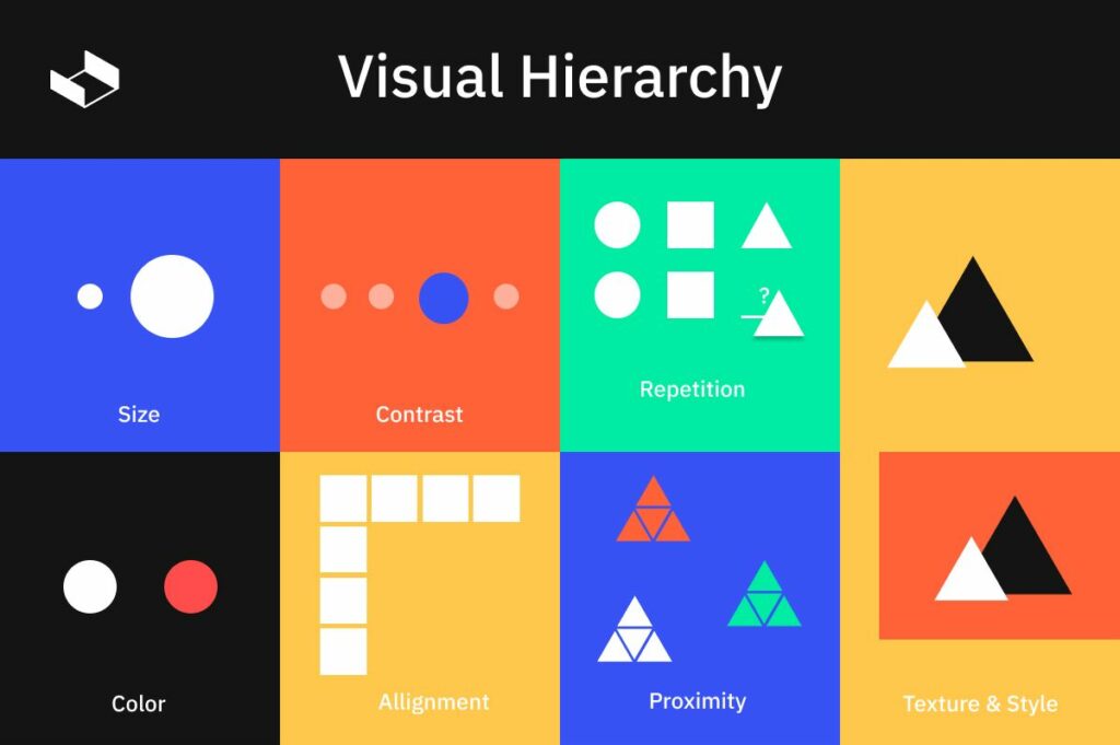
When using hierarchy in graphic design, designers consider size, contrast, color, and placement to arrange elements on a page or screen. Large-scale objects are placed at the top of the visual plane as these commands more attention from viewers than smaller objects placed lower down within the composition. Contrasting colors can also be used for emphasis as well as combining images with text for further effect.
Visual Impactful Results

When it comes to creating a successful and visually impactful design, hierarchy is key. Graphic designers must use a hierarchical approach in order to create results that will stand the test of time and remain relevant to their audience.
For example, a well-crafted logo may be at the top of an image with other elements following in descending order according to importance or relevance. The most important element should be placed at the top, followed by supporting elements located further down in the hierarchy. This helps viewers quickly differentiate between primary and secondary content, allowing them to focus on the most essential information first.
Effective Use of Hierarchy
For graphic designers, hierarchy can be an invaluable tool. When implemented correctly, it helps create powerful visuals and ensures clear communication. Establishing a visual hierarchy gives the audience easy access to necessary information while creating impactful results.
Hierarchy is the ability to organize content in a way that cues which elements should be given more or less attention. This could include size, color, font, alignment, and scale/proportion of elements. By demonstrating importance through the size and weight of items on a page or screen, viewers can quickly understand where to look first for crucial information or details within a design project. Graphic designers rely heavily on the power of hierarchy when creating layouts for print materials such as brochures and books or digital media such as websites and apps.
Well-structured hierarchies provide cues that draw attention to the most important elements on a page, such as text or images while relegating secondary information to lower levels of importance. By using hierarchy effectively, graphic designers are able to ensure that their designs will have maximum impact and provide an organized experience for viewers. In this article, we’ll explore how graphic designers rely on hierarchy for effective results in their work.
Conclusion
The art of graphic design is a complex and ever-evolving field. It requires an understanding of the natural principles that govern visual communication, as well as an awareness of the various elements necessary to create a successful composition. Graphic designers rely on hierarchy to help break down these components into manageable pieces and achieve impactful results.
Hierarchy is the practice of arranging a series of elements in order from most important to least important. By understanding how hierarchies work, graphic designers can guide viewers through their images and draw attention to key messages or features. Through the clever use of scale, color, contrast, and other design elements, they are able to take vague concepts or ideas and make them visually powerful statements that carry meaning.
Graphic design has become a valuable tool for businesses seeking creative ways to communicate with their audiences or express their brand identity.
Hope you enjoy this article, if you found something valuable, please don’t forget to share it with other audiences too. I’d much appreciate it. If you have any opinions please leave me a comment. Thank you for reading.
