Mobile-Friendly Is the New Standard for SEO
A mobile-friendly website is one that is designed to be easily viewed and used on a mobile device, such as a smartphone or tablet. Mobile-friendliness is important for SEO because it helps ensure that your website will show up in mobile search results.
Google has said that they are now using a “mobile-first” approach to indexing websites, which means that the mobile version of your site is what Google will use to determine your site’s ranking in search results. This means that if your website is not mobile-friendly, it could be at a disadvantage in terms of SEO.
The Benefits of Going Mobile-Friendly
As more and more people use their mobile devices to access the internet, it’s becoming increasingly important for businesses to have a mobile-friendly website. A mobile-friendly website is one that is designed to be easy to read and navigate on a smaller screen. Here are some of the benefits of having a mobile-friendly website:
1. Increased traffic. Mobile traffic has been growing steadily for years and now accounts for a significant portion of internet traffic. If your website isn’t optimized for mobile users, you’re likely missing out on a lot of potential visitors.
2. Improved SEO. Google has stated that they give preference in their search results to websites that are mobile-friendly. So if you want your website to rank well in Google, it’s important to make sure it’s optimized for mobile devices.
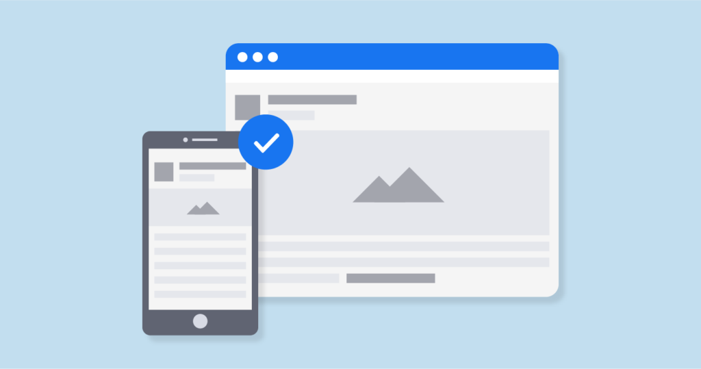
3. Enhanced user experience. With a responsive website, users can view your site on any device and get a consistent experience. They don’t have to worry about zooming in or out or switching to a mobile version of your site.
4. Increased conversions. Because mobile users are often using your site on the go, you need to make sure that your website is easy for them to use when they’re in a hurry. A responsive design will help them easily navigate your site without getting frustrated or giving up.
5. Lower bounce rate. Mobile users tend to browse less time on your site and bounce more often. With a responsive design, you’ll have a better chance of keeping them on your site longer.
Making the Switch
As more and more people use their mobile devices to access the internet, it’s important to make sure your website is optimized for them. Here are some tips to make your website mobile-friendly:
1. Use a responsive design: This means that your website will adjust to fit whatever screen size it’s being viewed on.
2. Keep your content concise: Mobile users are often looking for quick answers, so make sure your content is easy to scan and get through.
3. Use large, easy-to-tap buttons: Mobile users often have smaller fingers, so you want to make sure they can easily navigate your site.
4. Avoid pop-ups: These are especially annoying on mobile devices and can deter people from visiting your site again.
5. Use WordPress Theme. If you are using WordPress as your CMS (Content Management System), then it is recommended to use a mobile-friendly WordPress theme. It was easy to install and code-free, plug, and use.
How mobile-friendliness can improve SEO results
When it comes to SEO, mobile-friendliness is essential. Google’s mobile-first indexing means that the search engine considers the mobile version of your website to be the primary version. This is why a responsive website design is so important.
If your website isn’t mobile-friendly, you’re likely to see a drop in your search engine rankings. A recent study found that 61% of users are unlikely to return to a site that isn’t mobile-friendly and 40% will visit a competitor’s site instead.
Mobile-friendliness is also important for user experience. People are more likely to abandon a purchase if they have a bad experience on their mobile devices. If your website isn’t optimized for mobile, you could be losing out on potential customers.
Conclusion
As mobile devices become more prevalent, it’s important for businesses to have a mobile-friendly website. Mobile-friendliness is now a ranking factor for Google, so businesses that want to rank well in search results need to make sure their site is optimized for mobile.
There are a few things businesses can do to make sure their site is mobile-friendly. First, they should use responsive design, which means the site will resize itself to fit any screen size.
Second, they should use large font sizes and buttons so that users can easily tap on links. Finally, businesses need to make sure their site is fast, always monitor image size and minify code.
Making your website mobile-friendly is essential for SEO in today’s market. By following the tips above, you can ensure that your site is ready for the growing number of mobile users.
If you found something useful in this article, please help me to share it with other audiences too. Much much appreciate it. Please leave me a comment if you have any questions about it. Thank you for reading.